React development in the repository
Javascript source files will usually be in the following locations:
ui/model-name
├── semantic-ui
│   ├── js
│       └── model-name
│           ├── forms
│           │   ├── index.js
│           │   ├── FormActionsContainer.jsx
│           │   └── FormFieldsContainer.jsx
│           └── search
│               ├── index.js
│               ├── ResultsGridItem.jsx
│               └── ResultsListItem.jsx
Generally, for easier development, we recommend to stick with placing your javascript files in the js/model-name folder.
React components overriding
The overriding principle is used for when you wish to replace a component with your own implementation. This is useful when you want to customize the behavior or appearance of a component without modifying the original source code. The overriding is done by using react-overridable library, which provides a few ways how to override a component. In short, you can:
- Parametrize component, which means that you are basically passing certain props to it
- Override the part of the component that is wrapped in the
Overridablecomponent. This is useful when you want to replace a specific part of a component with your own implementation. - Override the whole component, which means that you are replacing the whole component with your own implementation.
In practice, the first two are mostly used. More can be read on https://github.com/indico/react-overridable (opens in a new tab). Overriding is a very important principle used across the whole repository. It is most notably used as part of search apps, as it is obvious that those apps, will usually have many same components across different instances, but will need to have one or two different components depending on the use case.
Search apps
Introduction
Search functionality is a critical component of any modern application, enabling users to quickly find relevant information within your data collection. The search implementation in our system provides powerful tools for filtering, sorting, and discovering content efficiently.
This documentation section will guide you through implementing, customizing, and optimizing search features in your frontend application.
The search app will be available at /model-name/ i.e. /documents/ in case of model named documents. Note that some repositories may have multiple models, in which case global search will come into play. This will be discussed in a separate section. For now, it is important to note, that for every model, there will be a search app available at /model-name/.
Components
Front end for search page is powered by react-searchkit from invenio https://inveniosoftware.github.io/react-searchkit/ (opens in a new tab)
The library exports basic components that make up the search (facets, filters, search options ...). In our apps, we provide functionality that just bootstraps the search app UI with sensible defaults. The entry point to the search app is index.js file in search folder.
Example index.js file:
import {
  parseSearchAppConfigs,
  createSearchAppsInit,
  HistogramWSlider,
} from "@js/oarepo_ui/search";
import { parametrize } from "react-overridable";
import ResultsListItem from "./ResultsListItem";
import { SearchAppFacets } from "@js/oarepo_ui/search/SearchAppFacets";

const SearchAppFacetsWithProps = parametrize(SearchAppFacets, {
  allVersionsToggle: true,
});

const [{ overridableIdPrefix }] = parseSearchAppConfigs();

export const componentOverrides = {
  [`${overridableIdPrefix}.SearchApp.facets`]: SearchAppFacetsWithProps,
  [`${overridableIdPrefix}.ResultsList.item`]: ResultsListItem,
  [`${overridableIdPrefix}.BucketAggregation.element.syntheticFields_year`]:
    HistogramWSlider,
};

createSearchAppsInit({ componentOverrides });- createSearchAppsInit is a function that bootstraps the search app. The main parameter it takes, are the component overrides. This is basically a mapping of the component id and the component that you want to use instead.
- overridableIdPrefix is a prefix that is used to namespace different search apps, across your application, in order to be able to target a specific component in a specific search app. After you generate the app, the prefix will consist from the model name and search i.e. it could be something like Documents.Search for model named documents.
It is very important to get familiar with react dev tools browser extension (https://react.dev/learn/react-developer-tools (opens in a new tab)) as it will be a very valuable tool in finding out the id that you can use to override a specific component.
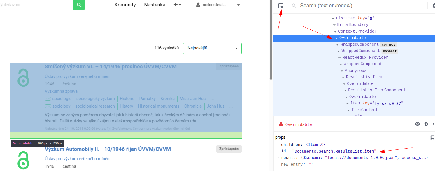
Generally speaking, the component that you will always need to override is the ResultsListItem, as it is highly likely that you will simply have different metadata model or that you may want to display different information in the search results. ResultsListItem component is automatically generated for you when you create the model. The component automatically receives result object as a prop, from which you can extract the metadata that you want to display. Here is an example of one such component: https://github.com/Narodni-repozitar/nr-docs/blob/main/ui/documents/semantic-ui/js/documents/search/ResultsListItem.jsx (opens in a new tab)
Components you can override in a search app are listed below (note that the list is not exhaustive):
[`${overridableIdPrefix}.ActiveFilters.element`]: ActiveFiltersElement,
[`${overridableIdPrefix}.BucketAggregation.element`]:
    FoldableBucketAggregationElement,
[`${overridableIdPrefix}.BucketAggregationValues.element`]:
    BucketAggregationValuesElement,
[`${overridableIdPrefix}.Count.element`]: CountElement,
[`${overridableIdPrefix}.EmptyResults.element`]: EmptyResultsElement,
[`${overridableIdPrefix}.Error.element`]: ErrorElement,
[`${overridableIdPrefix}.SearchApp.facets`]: SearchAppFacets,
[`${overridableIdPrefix}.SearchApp.layout`]: SearchAppLayout,
[`${overridableIdPrefix}.SearchApp.resultOptions`]:
    SearchAppResultOptions,
[`${overridableIdPrefix}.SearchApp.searchbarContainer`]:
    SearchAppSearchbarContainerWithConfig,
[`${overridableIdPrefix}.SearchFilters.Toggle.element`]:
    RDMToggleComponent,
[`${overridableIdPrefix}.SearchApp.sort`]: SearchAppSort,
[`${overridableIdPrefix}.SearchApp.results`]: SearchAppResults,
[`${overridableIdPrefix}.SearchBar.element`]: SearchappSearchbarElement,
[`${overridableIdPrefix}.ResultsList.container`]: ListItemContainer,
At the same time, these are the default components that will exist in your search app, when you are first starting development of your app.
Available resources (components)
Components are mainly wrappers around the react-searchkit components, which are adapted to our needs. For details, we propose reading the react-searchkit docs (opens in a new tab).
Forms
There are many forms scattered across the repository. Naturally, the most important one is the deposit form, which is used to deposit new records into the repository. Same as for search, you may also have multiple deposit forms, depending on if you have multiple models in your repository.
Philosophy
Forms in our repositories are powered by Formik (https://formik.org/ (opens in a new tab)). This means that components are basically Semantic UI "primitives" wrapped in Formik "primitives". Some of these components take quite a lot of props, so getting familiar with both libraries would be very beneficial, in order to have efficient development process.
In terms of validation, we made a decision to use only back end validation. The reason for this decision is, when you have a big form, with many fields, it is very difficult to keep the validation exactly the same between the front end and the back end. Of course, it is still possible to use front end validation, but it can happen that components that we already have, might not behave in the way that you would expect (in case of front end validation).
After you create the model, you will have a basic form template created for you. The form is located forms folder. Similarly to the search app, the entry point is index.js file that contains the bootstrapping function that initiates the form.
Example index.js file:
import { createFormAppInit, parseFormAppConfig } from "@js/oarepo_ui/forms";
import FormActionsContainer from "./FormActionsContainer";
import FormFieldsContainer from "./FormFieldsContainer";


const { formConfig } = parseFormAppConfig();


const { overridableIdPrefix } = formConfig;

export const componentOverrides = {

  [`${overridableIdPrefix}.FormActions.container`]: FormActionsContainer,
  [`${overridableIdPrefix}.FormFields.container`]: FormFieldsContainer,
};

createFormAppInit({ componentOverrides });
You will also get two components created for you, FormActionsContainer and FormFieldsContainer.
- FormActionsContainer is the component on the right hand side that contains the buttons for the form (save, preview, etc.). It also contains requests app, that can contain different actions, depending on the repo configuration. Most common example, would be action that initiates record publication process. Also, there is the Embargo section that is used to set embargo on the record.
- FormFieldsContainer is the component on the left hand side that contains the form fields. Form fields are usually divided into logical sections (accordions). Therefore, you will be adding your fields to this component.
Example of FormFieldsContainer component (opens in a new tab).
There are many done components that you can just import and use in your forms. The main sources of these components are:
- react-invenio-forms (opens in a new tab)
- oarepo-ui (form components) (opens in a new tab)
- oarepo-vocabularies (form components) (opens in a new tab)
- invenio-rdm-records (opens in a new tab)
Field metadata
Normally, you need to provide field metadata for each field via props (label, placeholder, required etc.). This can be error prone and difficult to do consistently across the application, especially when you take into account the localization as well. The model(s) (yaml files(s) that contain repository metadata definition) are the source of truth for the field metadata. Meaning, when defining your model, you will also define the field metadata there. The exact way how to do this, will be explained in the model section, but here is a short example for a field named givenName:
    givenName:
      type: keyword
      label.cs: Křestní jméno
      label.en: Given Name
      hint.cs: Uveďte jméno autora.
      hint.en: "Fill in the author's given name."
      required: true
During the model compilation process, field metadata will be extracted from the model and stored in a file in your app called ui.json (model-name/models/ui.json). Now in your form components, you can use a hook from oarepo-ui, to get the field metadata.
Sample usage:
import { useFieldData, useSanitizeInput } from "@js/oarepo_ui/forms";
import PropTypes from "prop-types";

export const TextField = ({
  fieldPath,
  icon,
  ...rest
}) => {
  const { getFieldData } = useFieldData();

  return (
    <InvenioTextField
      optimized
      fieldPath={fieldPath}
      {...getFieldData({ fieldPath, icon })}
      {...rest}
    />
  );
};
Understanding the getFieldData Function
The getFieldData function plays a critical role in accessing field metadata defined in your model. Looking at its implementation in the codebase:
// From util.js
export const getFieldData = (uiMetadata, fieldPathPrefix = "") => {
  return ({
    fieldPath,
    icon = "pencil",
    fullLabelClassName,
    compactLabelClassName,
    fieldRepresentation = "full",
    ignorePrefix = false,
  }) => {
    // Function implementation...
  };
};
How It Works
-
Function Signature: The function takes two parameters:
uiMetadata: Contains all field metadata from ui.jsonfieldPathPrefix: Optional prefix for nested fields (default: "")
-
Returns: A higher-order function that takes an object with the following parameters:
fieldPath(required): Path to the field in dot notation (e.g., "metadata.title")icon(optional): Icon to display next to the field label (default: "pencil")fullLabelClassName(optional): CSS class for full representation labelcompactLabelClassName(optional): CSS class for compact representation labelfieldRepresentation(optional): How to represent the field - "full", "compact", or "text" (default: "full")ignorePrefix(optional): Whether to ignore the fieldPathPrefix (default: false)
-
Field Representation Options:
full: Returns a label with icon and help text shown separatelycompact: Returns a compact label with help text shown in a popuptext: Returns plain text values without React components
-
Returns Object: Depending on the fieldRepresentation, returns an object with:
label: React component or texthelpText: Help text for the fieldplaceholder: Hint text for the fieldrequired: Boolean indicating if field is requireddetail: Additional detail information (if provided in model)
Usage Pattern
When you use the useFieldData hook, it provides you with the getFieldData function that's already configured with the UI metadata from the context:
// Inside your component
const { getFieldData } = useFieldData();

// Field metadata automatically loaded
const fieldMetadata = getFieldData({
  fieldPath: "metadata.title",
  icon: "book"
});

// Use metadata with your component
<InvenioTextField
  fieldPath="metadata.title"
  {...fieldMetadata}
/>
This approach keeps your form field definitions clean and consistent while maintaining all metadata in your model definition.
It is important to note, that content returned by the function is memoized, and therefore, it is necessary to use this function call only on the top level of the component, otherwise, it will be breaking the rule of hooks in React.
Good vs. Bad Usage Examples
✅ Good Usage - At Component Top Level
const AuthorForm = () => {
  const { getFieldData } = useFieldData();

  // Good: Call getFieldData at the top level of your component
  const nameFieldMetadata = getFieldData({
    fieldPath: "metadata.authors.name",
    icon: "user"
  });
  const affiliationFieldMetadata = getFieldData({
    fieldPath: "metadata.authors.affiliation",
    icon: "building"
  });

  return (
    <div>
      <InvenioTextField
        fieldPath="metadata.authors.name"
        {...nameFieldMetadata}
      />
      <InvenioTextField
        fieldPath="metadata.authors.affiliation"
        {...affiliationFieldMetadata}
      />
    </div>
  );
};
❌ Bad Usage - Inside a Loop or Conditional
const AuthorsList = ({ authors }) => {
  const { getFieldData } = useFieldData();

  return (
    <div>
      {authors.map((author, idx) => (
        <div key={idx}>
          {/* Bad: Calling getFieldData inside a map or loop */}
          <InvenioTextField
            fieldPath={`metadata.authors[${idx}].name`}
            {...getFieldData({
              fieldPath: `metadata.authors[${idx}].name`,
              icon: "user"
            })}
          />

          {/* This breaks React's rules of hooks because the number of hook calls
              can vary between renders depending on authors.length */}
        </div>
      ))}
    </div>
  );
};
✅ Correct Approach for Dynamic Fields
const AuthorsList = ({ authors }) => {
  const { getFieldData } = useFieldData();

  // Good: Create a component that uses getFieldData at its top level
  const AuthorField = ({ index }) => {
    const fieldPath = `metadata.authors[${index}].name`;
    const metadata = getFieldData({ fieldPath, icon: "user" });

    return (
      <InvenioTextField
        fieldPath={fieldPath}
        {...metadata}
      />
    );
  };

  return (
    <div>
      {authors.map((author, idx) => (
        <div key={idx}>
          <AuthorField index={idx} />
        </div>
      ))}
    </div>
  );
};
This pattern ensures that React's rules of hooks are followed while still allowing you to use field metadata in dynamic contexts.
Available components
Here we will list the most commonly used components that you can use in your forms. Majority of components are using getFieldData internally, so you don't need to worry about passing field metadata via props, through it is still possible to do so.
Basic text input
import { TextField } from "@js/oarepo_ui/forms";

<TextField fieldPath="metadata.title" />
This component is a wrapper of invenio's TextField (opens in a new tab)
Props
| Prop | Type | Default | Description |
|---|---|---|---|
fieldPath | string | (required) | Path to the field in dot notation (e.g., "metadata.title") |
fieldRepresentation | string | "full" | How to represent the field - "full", "compact", or "text" |
icon | string | "pencil" | Icon to display next to the field label |
...rest | any | - | Any additional props are passed directly to InvenioTextField |
The component automatically applies:
- Field metadata (labels, help text, etc.) from your model definition
- Input sanitization on blur to prevent XSS attacks
- Proper field touch handling for Formik
HTML input
In Invenio RDM, there is Tiny MCE added as a dependency, therefore, we use it as well.
To add rich editor to your form, you can use the following component (opens in a new tab):
import { RichInputField } from "react-invenio-forms";
import { OarepoRichEditor } from "@js/oarepo_ui/forms";

<RichInputField
  fieldPath="metadata.description"
  label={i18next.t("Description")}
/>Note: Unlike many other components in our system, RichInputField doesn't use getFieldData internally, so you need to provide all field metadata props explicitly or wrap it in a custom component that uses getFieldData.
Props
| Prop | Type | Default | Description |
|---|---|---|---|
fieldPath | string | (required) | Path to the field in dot notation |
label | string|node | undefined | Label for the field |
required | boolean | false | Whether the field is required |
className | string | undefined | Additional CSS class for the field |
editor | elementType | undefined | Editor component to use (e.g., <OarepoRichEditor />) |
editorConfig | object | undefined | Configuration options for the editor |
Date input
Our repository provides two specialized date picker components based on the react-datepicker (opens in a new tab) npm package. These components support the Extended Date/Time Format (EDTF) specification with various precision options (year, month, day).
- EDTFSingleDatePicker (opens in a new tab) - For selecting a single date with EDTF support
- EDTFDaterangePicker (opens in a new tab) - For selecting a date range with EDTF support
Both components allow users to:
- Select dates from a calendar interface
- Choose different date precision levels (year, month, day)
- Clear selected dates
- Handle EDTF date format serialization/deserialization
EDTFSingleDatePicker
Used for selecting a single date:
import { EDTFSingleDatePicker } from "@js/oarepo_ui/forms";

<EDTFSingleDatePicker
  fieldPath="metadata.publicationDate"
/>
Props
| Prop | Type | Default | Description |
|---|---|---|---|
fieldPath | string | (required) | Path to the field in dot notation |
label | string|node | (from model) | Custom label for the field |
icon | string | "calendar" | Icon to display next to the field label |
helpText | string | (from model) | Help text for the field |
required | boolean | (from model) | Whether the field is required |
datePickerPropsOverrides | object | Additional props to override default DatePicker behavior |
EDTFDaterangePicker
Used for selecting a date range or toggling between range and single date (in case where start and end date are the same):
import { EDTFDaterangePicker } from "@js/oarepo_ui/forms";

<EDTFDaterangePicker
  fieldPath="metadata.eventDateRange"
/>
Props
| Prop | Type | Default | Description |
|---|---|---|---|
fieldPath | string | (required) | Path to the field in dot notation |
label | string|node | (from model) | Custom label for the field |
icon | string | "calendar" | Icon to display next to the field label |
helpText | string | (from model) | Help text for the field |
required | boolean | (from model) | Whether the field is required |
singleDateInputPlaceholder | string | "Choose one date." | Placeholder when in single date mode |
dateRangeInputPlaceholder | string | "Choose date range (From - To)." | Placeholder when in date range mode |
datePickerPropsOverrides | object | Additional props to override default DatePicker behavior |
Both components:
- Save dates in EDTF format to match backend requirements
- Allow switching between different date precision levels (year only, year-month, or full date)
- Handle Formik form integration automatically
- Apply field metadata from your model definition
Multilingual inputs
Our repository provides specialized components for handling multilingual content. These components combine language selection with text input fields to enable content entry in multiple languages.
There are two main multilingual input components:
- I18nTextInputField (opens in a new tab) - For plain text multilingual input
- I18nRichInputField (opens in a new tab) - For rich text (HTML) multilingual input with Tiny MCE editor
Both components combine a language selector with an input field, allowing users to specify both the content and the language it's written in.
I18nTextInputField
Used for entering plain text in multiple languages:
import { I18nTextInputField } from "@js/oarepo_ui/forms";

<I18nTextInputField
  fieldPath="metadata.multilingualTitle"
/>
The component stores data in the format:
{
  "lang": "en",
  "value": "Title in English"
}
Props
| Prop | Type | Default | Description |
|---|---|---|---|
fieldPath | string | (required) | Path to the field in dot notation |
lngFieldWidth | number | 3 | Width of the language selector field (1-16) |
...rest | any | - | Any additional props are passed to the TextField component |
I18nRichInputField
Used for entering formatted text (HTML) in multiple languages:
import { I18nRichInputField } from "@js/oarepo_ui/forms";

<I18nRichInputField
  fieldPath="metadata.multilingualDescription"
/>
The component stores data in the same format as I18nTextInputField but allows rich text editing:
{
  "lang": "en",
  "value": "<p>Description with <strong>formatting</strong></p>"
}
Props
| Prop | Type | Default | Description |
|---|---|---|---|
fieldPath | string | (required) | Path to the field in dot notation |
lngFieldWidth | number | 3 | Width of the language selector field (1-16) |
editorConfig | object | undefined | Configuration options for the rich text editor |
...rest | any | - | Any additional props are passed to the RichInputField component |
Both components:
- Automatically handle form state through Formik
- Combine a language selector with input field in a single row
- Apply XSS protection and input sanitization
- Use field metadata from your model definition
Vocabulary inputs
Most often your record will contain some fields that derive values from controlled sources i.e. vocabularies. These fields are usually represented as dropdowns, where you can select the value from the list of available values.
Our repository provides two main types of vocabulary selection components:
- LocalVocabularySelectField (opens in a new tab) - For selecting values from a pre-loaded local vocabulary
- VocabularySelectField (opens in a new tab) - For selecting values from a remote vocabulary using API requests
Usage in FormFieldsContainer
Here's how these components are typically used within a form:
import {
  LocalVocabularySelectField,
  VocabularySelectField,
} from "@js/oarepo_vocabularies/form";

// Inside your FormFieldsContainer component
return (
  <>
    {/* Simple dropdown for resource types */}
    <LocalVocabularySelectField
      fieldPath="metadata.resourceType"
      optionsListName="resource-types"
    />

    {/* API-powered selection for subjects */}
    <VocabularySelectField
      fieldPath="metadata.languages"
      type="languages"
      multiple={true}
    />
  </>
);
LocalVocabularySelectField
LocalVocabularySelectField allows selecting values from a pre-loaded vocabulary that is available in the form configuration. This component is efficient for smaller vocabularies that can be completely loaded at initialization time.
Example
<LocalVocabularySelectField
  fieldPath="metadata.languages"
  optionsListName="languages"
/>
Props
| Prop | Type | Default | Description |
|---|---|---|---|
fieldPath | string | (required) | Path to the field in dot notation |
optionsListName | string | (required) | Name of the vocabulary in formConfig.vocabularies |
fieldRepresentation | string | "full" | How to represent the field - "full", "compact", or "text" |
multiple | boolean | false | Whether multiple selections are allowed |
showLeafsOnly | boolean | false | If true, only leaf nodes in hierarchical vocabularies will be shown |
filterFunction | function | undefined | Custom function to filter available options |
icon | string | "tag" | Icon to display next to the field label |
clearable | boolean | true | Whether the field can be cleared |
Data Structure
The component stores selected value(s) in the following format:
For single selection:
{
  "id": "en",
  ...rest,
}
For multiple selections:
[
  {
    "id": "en",
    ...rest,
  },
  {
    "id": "cs",
    ...rest
  }
]
This component is useful for vocabularies that are not very large and can be loaded at once. It provides a simple dropdown interface for users to select from. The benefit is that it is very fast and does not require any API calls to load the options. Supports also search by typing in a limited capacity as it is happening on the front end.
VocabularySelectField
VocabularySelectField provides an autocomplete-style input that loads options dynamically via API calls. This is useful for large vocabularies where it's impractical to load all options at once.
Example
<VocabularySelectField
  fieldPath="metadata.subjects"
  type="subjects"
  multiple={true}
/>
Props
| Prop | Type | Default | Description |
|---|---|---|---|
fieldPath | string | (required) | Path to the field in dot notation |
type | string | (required) | Type of vocabulary (corresponds to API endpoint) |
multiple | boolean | false | Whether multiple selections are allowed |
filterFunction | function | opt => opt | Function to filter suggestions from API |
...rest | any | - | Any additional props are passed to RelatedSelectField |
API Integration
The component automatically constructs API URLs in the format:
- Regular suggestions:
/api/vocabularies/{type}
This type is used for fetching suggestions based on user input. The API will return a list of matching vocabulary items. The suggestions are using full power of opensearch (supports typos, missing letters etc.)
Using Vocabularies Together
For complex forms, these components can be used together to provide a comprehensive interface:
<AccordionField label="Document Classification">
  {/* Simple dropdown for basic types */}
  <LocalVocabularySelectField
    fieldPath="metadata.resourceType"
    optionsListName="resource-types"
  />

  {/* API-powered selection for free-form subjects */}
  <VocabularySelectField
    fieldPath="metadata.subjects"
    type="subjects"
    multiple={true}
  />
</AccordionField>
These vocabulary components help ensure data consistency by encouraging users to select from controlled terminology rather than entering free text. They automatically handle the serialization of selected values to match the expected backend data format.
Complex fields
Often you will have a need to create a complex field, meaning a field can have many subfields (nested), or a field can be a collection of fields (array). The most complex case is the array of nested fields (objects). Here is an example of array of nested fields that showcases how this can be done:
import React from "react";
import PropTypes from "prop-types";
import { ArrayField, GroupField } from "react-invenio-forms";
import { LocalVocabularySelectField } from "@js/oarepo_vocabularies";
import { StringArrayField, TextField } from "@js/oarepo_ui/forms";
import {
  ArrayFieldItem,
  EDTFDaterangePicker,
  useSanitizeInput,
  useFieldData,
} from "@js/oarepo_ui";
import { i18next } from "@translations/nr/i18next";
import { useFormikContext, getIn } from "formik";
import { Label } from "semantic-ui-react";

export const EventsField = ({ fieldPath }) => {
  const { values, setFieldValue, setFieldTouched, errors } = useFormikContext();

  const { sanitizeInput } = useSanitizeInput();
  const { getFieldData } = useFieldData();
  return (
    <ArrayField
      addButtonLabel={i18next.t("Add event")}
      fieldPath={fieldPath}
      {...getFieldData({ fieldPath, fieldRepresentation: "text" })}
      addButtonClassName="array-field-add-button"
    >
      {({ arrayHelpers, indexPath }) => {
        const fieldPathPrefix = `${fieldPath}.${indexPath}`;
        const eventNameOriginalFieldPath = `${fieldPathPrefix}.eventNameOriginal`;

        const beValidationErrors = getIn(errors, "BEvalidationErrors", {});
        const eventLocationError = beValidationErrors?.errors?.find(
          (e) => e.field === `${fieldPathPrefix}.eventLocation`
        );

        return (
          <ArrayFieldItem
            indexPath={indexPath}
            arrayHelpers={arrayHelpers}
            className={"invenio-group-field events"}
            fieldPathPrefix={fieldPathPrefix}
          >
            <TextField
              width={16}
              fieldPath={eventNameOriginalFieldPath}
              onBlur={() => {
                const cleanedContent = sanitizeInput(
                  getIn(values, eventNameOriginalFieldPath)
                );
                setFieldValue(eventNameOriginalFieldPath, cleanedContent);
                setFieldTouched(eventNameOriginalFieldPath, true);
              }}
              fieldRepresentation="compact"
            />
            <StringArrayField
              width={16}
              fieldPath={`${fieldPathPrefix}.eventNameAlternate`}
              addButtonLabel={i18next.t("Add event alternate name")}
              fieldRepresentation="compact"
            />
            <EDTFDaterangePicker fieldPath={`${fieldPathPrefix}.eventDate`} />
            <GroupField>
              <TextField
                width={10}
                fieldPath={`${fieldPathPrefix}.eventLocation.place`}
                fieldRepresentation="compact"
              />
              <LocalVocabularySelectField
                width={6}
                fieldPath={`${fieldPathPrefix}.eventLocation.country`}
                optionsListName="countries"
                clearable
                fieldRepresentation="compact"
              />
            </GroupField>
            {eventLocationError && (
              <React.Fragment>
                <Label className="rel-mb-1 mt-0 ml-5" prompt pointing="above">
                  {eventLocationError.messages.join(" ")}
                </Label>
                <br />
              </React.Fragment>
            )}
          </ArrayFieldItem>
        );
      }}
    </ArrayField>
  );
};

EventsField.propTypes = {
  fieldPath: PropTypes.string.isRequired,
};
Formik's Dot Notation for Nested Fields
When working with complex data structures in Formik, you often need to reference nested fields in your form values. Formik uses a dot notation system to access these nested fields.
Basic Structure
For an object like this:
{
  "metadata": {
    "title": "My Document",
    "authors": [
      {
        "name": "John Doe",
        "affiliation": "University A"
      },
      {
        "name": "Jane Smith",
        "affiliation": "University B"
      }
    ]
  }
}
You would use dot notation to access nested fields:
metadata.title- Accesses the title fieldmetadata.authors- Accesses the authors arraymetadata.authors[0].name- Accesses the name of the first authormetadata.authors[1].affiliation- Accesses the affiliation of the second author
Fields in modal
Sometimes, if the field is very complex, you may want to put it inside of a modal. This allows for a more focused user experience and can help in managing complex data inputs without overwhelming the user. Putting a field inside a modal also has some drawbacks, as you need internal form (internal formik) to track the fields in the modal and then convert the data from the main form to modal and vice versa, which can be more work and can create difficulties when data is very nested. We recommend using modal only where it is really necessary, otherwise, try to keep the fields in the main form.
Example of such a field would be Creatibutors (opens in a new tab) field from RDM.